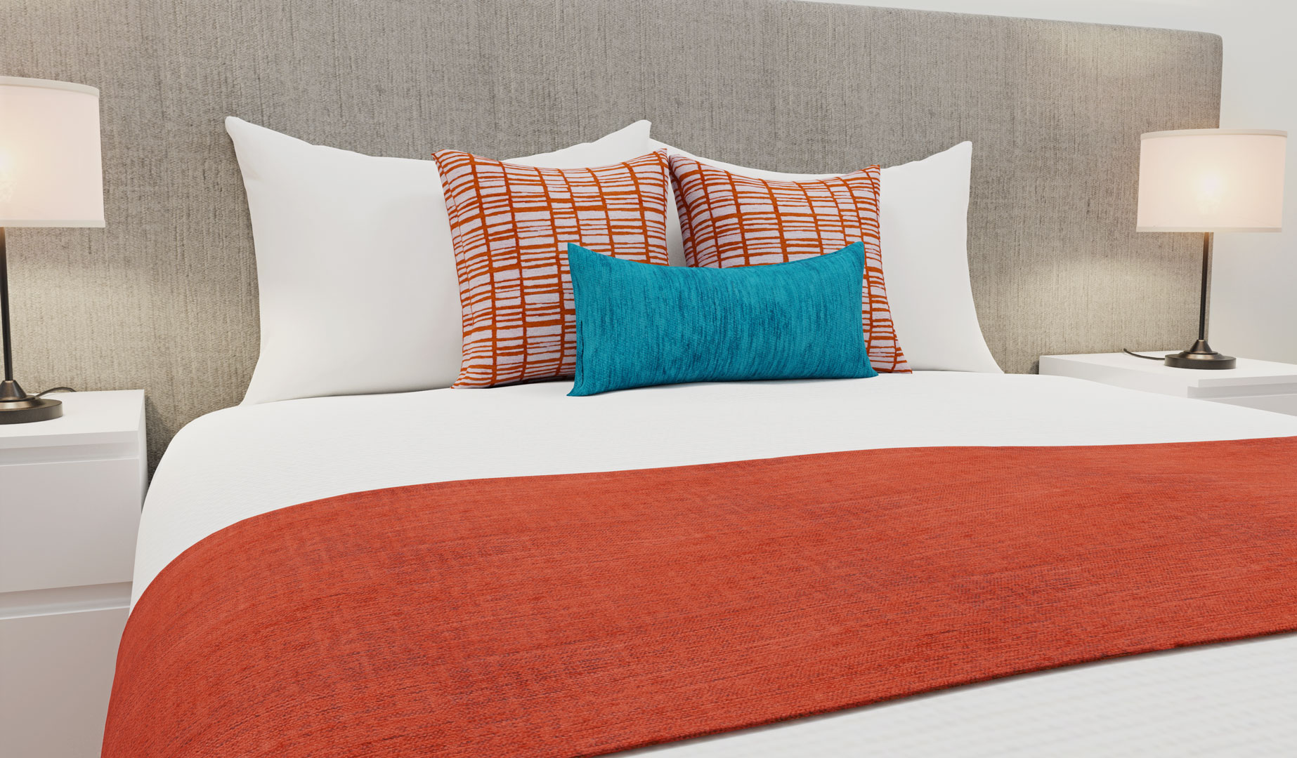
By: HotelHome Project Design Team 11th April, 2019
| Bed Runners | Cushions | Pantone Colour of the Year |
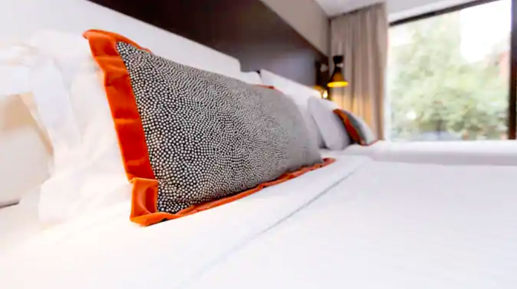
The Coral Bed Covering and Fabric Collection by HotelHome
Inspired by Pantone and the Pantone colour of the year LIVING CORAL.
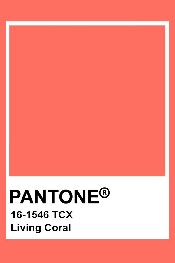 Vibrant, yet mellow PANTONE
16-1546 Living Coral embraces us with warmth and nourishment to provide comfort and buoyancy
in our continually shifting environment.

LIVING CORAL : Pantone’s 2019 Colour of the Year
According to Pantone’s panel of colour experts, “In reaction to the onslaught of digital technology and social media increasingly embedding into daily life, we are seeking authentic and immersive experiences that enable connection and intimacy. Living Coral embraces us with warmth and nourishment to provide comfort and buoyancy in our continually shifting environment. Representing the fusion of modern life, PANTONE Living Coral is a nurturing colour that appears in our natural surroundings and at the same time, displays a lively presence within social media.”
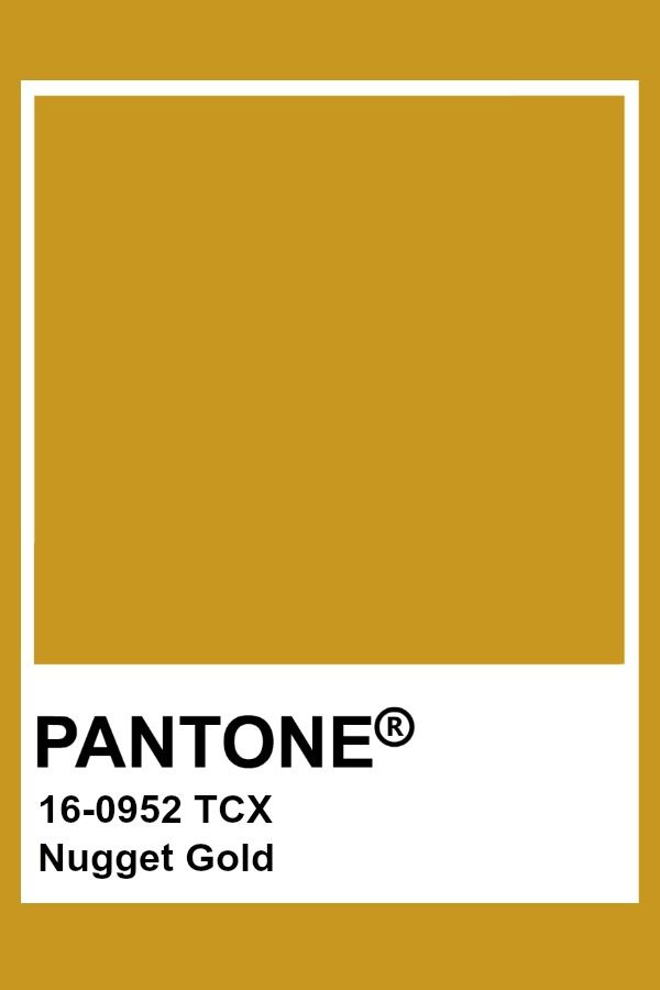
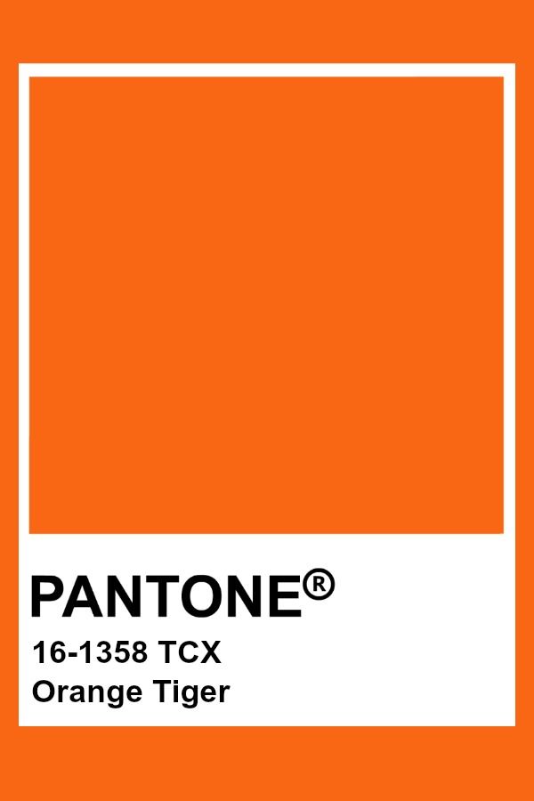
Other Pantone colours and favourites of the HotelHome design team, which are the perfect
co-ordinates to Living Coral include the below colour palette which is ideal for commercial interiors
and bed coverings.
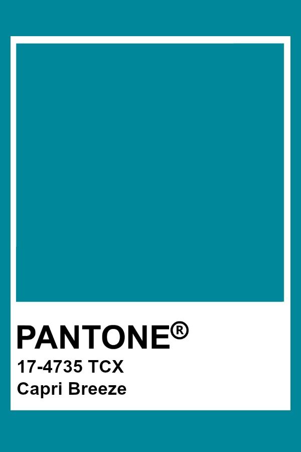
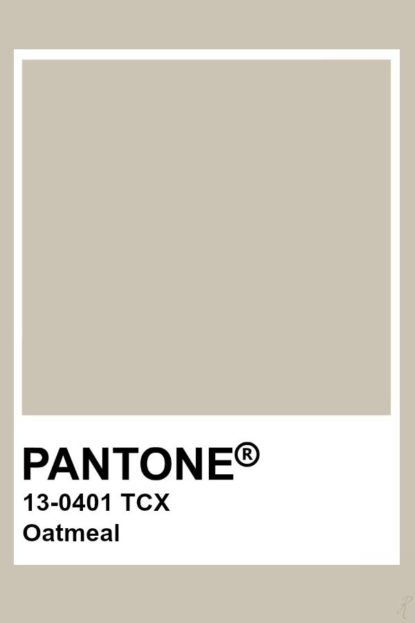
How to use colour correctly in accommodation soft furnishings, in this case using Hues of
Coral and Orange as a co-ordinate:
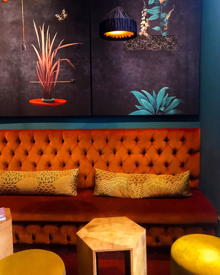
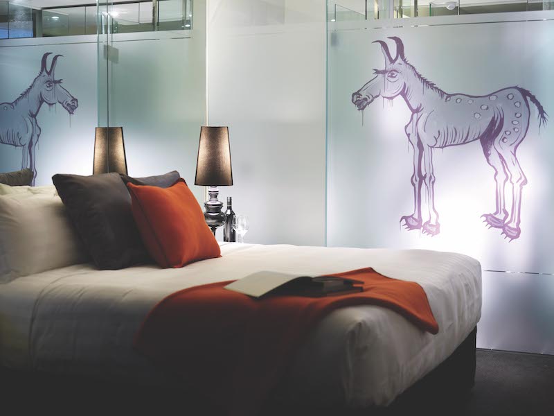
To create a restful yet still fresh and vibrant room for your guests to sleep in when using either bright or subtle hues of coral and orange, the HotelHome design team suggest introducing co-ordinates of blue, green, aqua and naturals including mustard and gold.
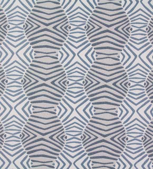
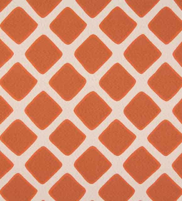
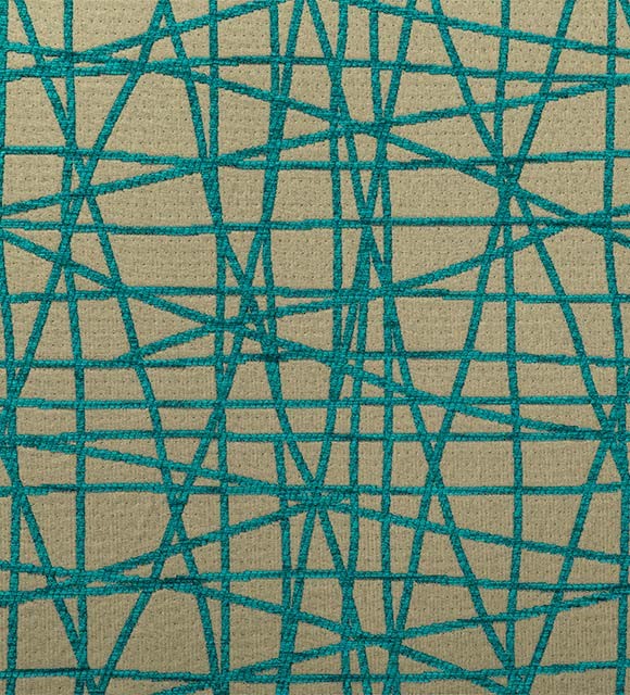
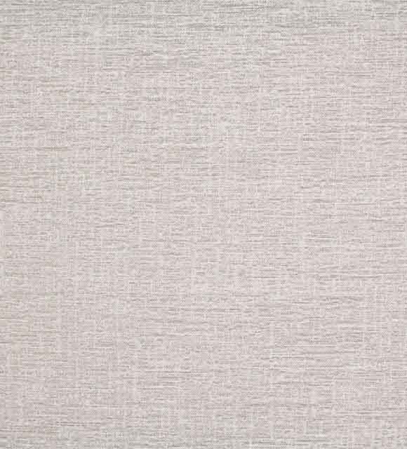
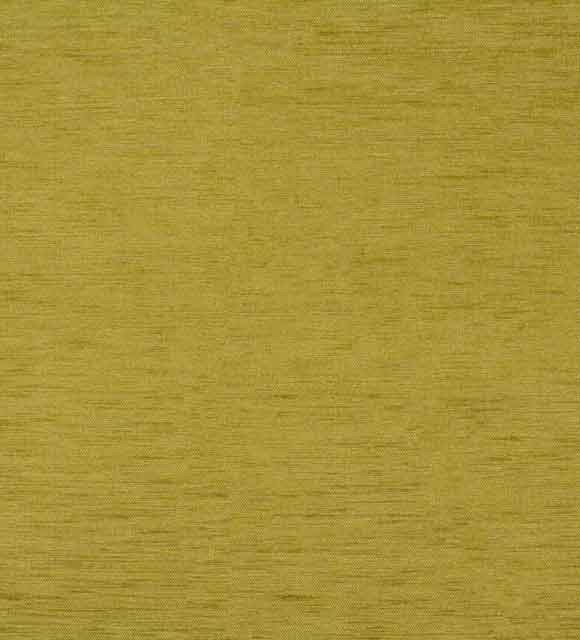
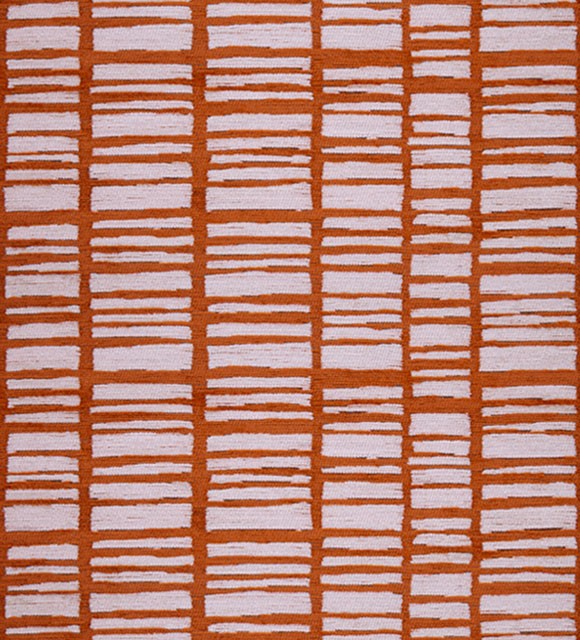
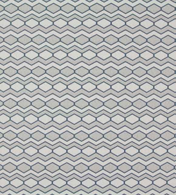
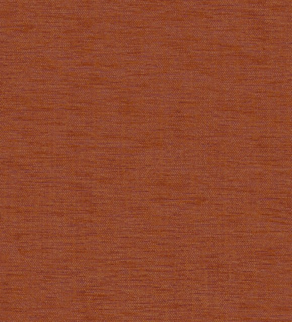
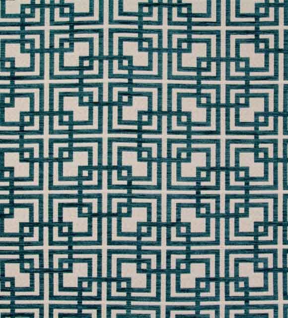
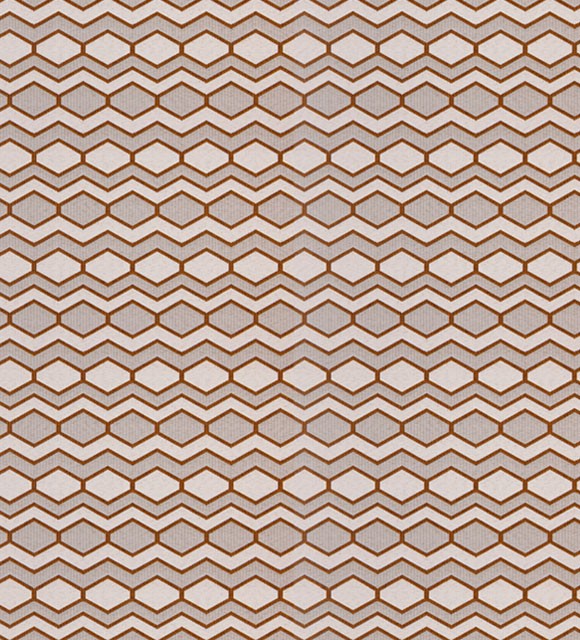
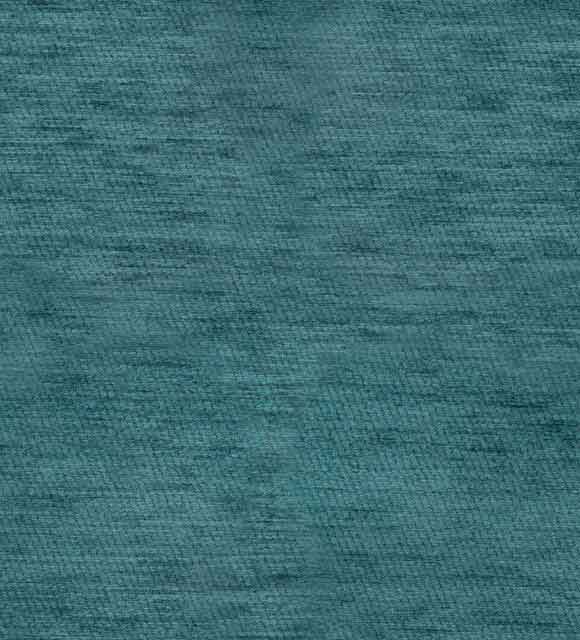
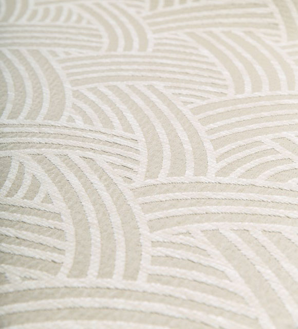
Please see a small selection of fabric design and colour examples from the HotelHome fabric collection:
Shades of Orange and Coral are always welcome options in all forms of
accommodation – no matter the star rating or location.
More About Pantone Colour of the Year
For 20 years, Pantone’s Color of the Year has influenced product development and purchasing decisions in multiple industries, including fashion, home furnishings, and industrial design, as well as product, packaging, and graphic design. The Color of the Year selection process requires thoughtful consideration and trend analysis. To arrive at the selection each year, Pantone’s color experts at the Pantone Color Institute comb the world looking for new color influences. This can include the entertainment industry and films in production, traveling art collections and new artists, fashion, all areas of design, popular travel destinations, as well as new lifestyles, playstyles, and socio-economic conditions. Influences may also stem from new technologies, materials, textures, and effects that impact color, relevant social media platforms and even upcoming sporting events that capture worldwide attention.
For further information or assistance in selecting the perfect design and colour combination for your property, contact the HotelHome customer service and design team today.
WANT MORE INFORMATION?
Chat with one of our dedicated Bed Covering specialists.
Or...
Send us a Message below:

